The Spanish Football Association has changed their logo which people are disliking
We have seen some logo downgrades and upgrades in recent times. One of them, if you remember, was the Juventus one which some people hate.
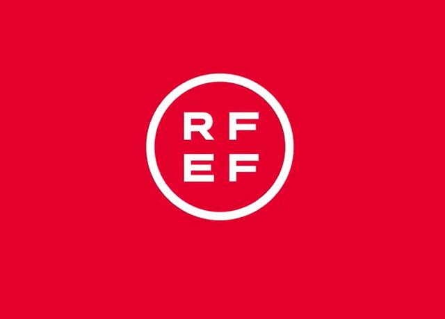
Meanwhile during the World Cup qualifiers, Spanish FA changed their logo to a very simple and unpopular one and which people are disliking.
The Spanish FA have officially changed their logo from the left picture to the right picture…
— MansionBet (@MansionBet) March 24, 2021
What a downgrade ??? pic.twitter.com/uVYcnoQQMP
Why it is unpopular? It’s because they created a very simple and only two color combination. Thinking of a red and white combination is good but the design is not that much attractive.
On the other side, clubs like Manchester City, FC Barcelona, Manchester United etc. had changed their logo in 21st century which their fans liked.
Also Read : Football Clubs with most titles in 21st century
Also Read : Most valuable defensive mid-fielders in the world